
As a “power user” who uses the Web more than most, I find a vertical tab layout more productive and a better use of the space afforded by widescreen monitors. So why don’t more browsers support it, or better still use it as the default?
The History
When the Web first became popular, most people were using 4:3 ratio SVGA (800 x 600) screens that were just big enough to display a website. Before (Firefox precursor) Phoenix’s release in 2002, mainstream browsers didn’t have a concept of tabs, and each web page (if you dared to open more than one at a time) appeared in its own window.
Over time, widescreen 16:9 and 16:10 ratios won out, and resolutions have grown ever larger, with even 4K now becoming affordable. I currently use dual QHD (2560 x 1440) displays which allows me to comfortably display two browser windows side-by-side on each. Due to the nature of the Web, designers need to cater for the worst case scenario, so many websites do not take full advatange of wides displays. The ideal line length for paragraph text is said to be between 45 and 75 characters, which is another reason why websites tend to be restricted in width. A number of base templates use 960 pixels as the standard website width for desktop display.
Admittedly some modern websites (image galleries, online spreadsheets, etc) make use of a greater page width when it’s available, but they’re in the minority, but even these sites are designed to work perfectly well at 960 px width – a legacy of the 1024 x 768 monitor days.
Modern computers running Windows 10 tend to have 8 GB or more of RAM, which provides plenty of space for opening numerous tabs. I’m lucky enough to have a fairly beefy workstation for graphics production and running virtual machines with 32 GB. While I’m working, I’ll typically have tabs open for various purposes including research, page variants that I’m working on, and a few “always-on” services like Gmail and Google Calendar. Having 20 ro 30 tabs open concurrently saves me a lot of time, increases my productivity, and using auto-hibernation, even that doesn’t have to take a lot of resources.
The Problem
For reasons which I can only assume to be tradition, most browsers only allow tabs to be arranged in a horizontal row along the top of the window. The concept of tabs as a User Interface control comes from the real-world use of tabs on top of files to allow quick navigation to the desired section. However, copying this idea directly into the world of web pages isn’t a great fit. It doesn’t allow many tabs to be displayed and when more are added the tabs are forced to get narrower, often to the extent that their titles are unreadable. This also means that tabs change size and position, which makes them harder to keep track of.
Here’s a quick mock-up to show how this manifests on a 16:9 screen. Note how the horizontal tab titles are truncated, and the wasted space to either side of the website content. The vertical tabs alternative allows the tab titles to be displayed in full – in fact the width of the tab pane can be adjusted by the user – and more content is visible before scrolling.


The page title (along with the favicon) is the main way of identifying a tab in the UI. If you have multiple tabs open for different pages from the same website, the favicon alone doesn’t help much. If we double the number of tabs, the problem becomes even greater.
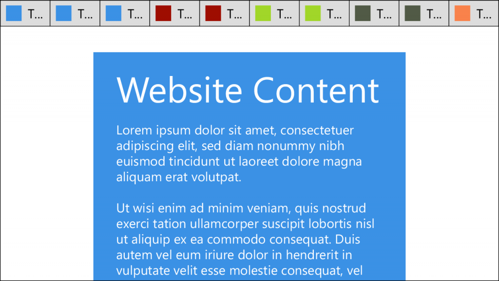
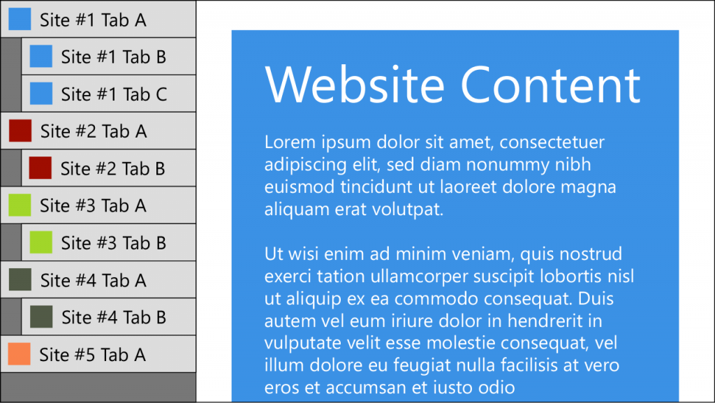
Now only a single character of the page title is visible in the horizontal layout. Notice how the vertical layout allows tabs from the same website to be nested, which instantly shows a hierarchy. It also lets groups of tabs be expanded or collapsed allowing even more tabs to be managed.
Browser Support
Chrome
Chrome has ~70% of the browser market, so as a Web Developer I regularly need to use it for testing. Back in 2011, v13 introduced “Side Tabs” as an experiment that could be enabled in chrome:flags. It was a rather half-baked implementation, but it did at least allow more tabs to be displayed and read. Sadly however, it has long since been removed.
Not only does Chrome not support vertical tabs, it also prevents extensions from adding this functionality in a useful way. I’ve tried Vertical Tabs & Bookmarks, vTabs, Tabs Outliner, and various other extensions, but none of these allows you to remove the native tab bar, and most appear in their own window, disconnected from the main Chrome window, which is frustrating to manage.
Firefox
Various “vertical tab” extensions are available for Firefox. I’ve used Tree Style Tab and Tree Tabs which are both now available as Web Extensions (compatible with current Firefox releases), and give you the option of nesting tabs in a tree. This lets you keep related tabs together in a structured way and easily manage a large number of tabs. Tree Style Tab is the better looking option, and integrates well with the Firefox UI. Performance was a problem in older versions with a large number of tabs open, but this no longer seems to be a problem.
Tree Tabs on the other hand looks rather old fashioned out of the box, with its swathes of Windows 98 grey, but delving into the options allows a certain level of customisation. Fine tuning can be achieved by editing userChrome.css if you know what you’re doing.
Edge
The latest version of Microsoft Edge (which uses the Chromium engine) allows vertical tabs, but doesn’t support nesting. It’s a lot better than forcing horizontal tabs, and there’s an argument that nested tabs is a more complex feature than most users need, but it would be nice to have the option.
Vivaldi
The Vivaldi browser offers vertical tabs natively, along with a wide range of customisation and tab management tools. It works well and puts the user firmly in control. It’s a great shame that Vivaldi isn’t as popular as it deserves to be.
Safari
A Vertical Tabs add-on is available for those of you who use Safari. It costs $0.99 on the App Store (when was the last time you saw a paid browser add-on for Windows?) and sadly doesn’t seem to garner great reviews.
Internet Explorer
You’re joking, right? If you’re still using IE, please consider upgrading to Edge, or even better Firefox. Twitter, Facebook, Github (and soon even Microsoft 365 and Teams) no longer support this ancient browser. Read more on this official Microsoft Blog.
My Tabs Setup
I do most of my dev work in Firefox, and I use Tree Style Tab to provide me with the most flexible layout options. I prefer a white-on-black colour scheme, and I’ve tweaked the options to my liking, so I have a useful context menu that includes Close Other Tabs, Close Tabs to Bottom, Collapse All Trees, etc. I’ve even used a customised userChrome.css to make it very clear when I have a live domain open, to clearly show the difference between my local server and the live production server. Production tabs are red as opposed to dark grey, so there’s no mistaking when I’m making a change that will go live.
You must be logged in to post a comment.